PART A_1
In this lesson, you will give a presentation about the topic
“Number of customers at a popular cafe” by using the graph below.
Then, I will give you feedback after your presentation.
“Number of customers at a popular cafe” by using the graph below.
Then, I will give you feedback after your presentation.
このレッスンでは、人気カフェの来客数について話しましょう。その後、講師がフィードバックをします。
PART A_2
(Please start your presentation now.)
プレゼンテーションを始めてください。

PART A_3
Thank you for your presentation. Now, I will give you feedback on your presentation.
(Please give feedback on your student’s presentation.)
PART A_4
Now, I will ask you three questions related to the topic of your presentation.
(Please make three questions based on your student’s presentation.)
次に講師がトピックに関連した質問をします。
PART A_5
| 1. | ? | |
| 2. | ? | |
| 3. | ? |
PART A_6
PART B_1
Now, I will start my presentation related to the topic. Please ask me some questions about it later.
今度は講師が同じトピックについて話します。終わったら講師に質問をしましょう。
PART B_2
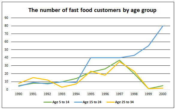
This graph shows the number of fast food customers by age group from 1990 to 2000. The vertical axis shows the number of people and the horizontal axis shows the years of the study. The blue line represents people aged 5 to 14, the orange line represents people aged 15 to 24, and the yellow line represents people aged 25 to 34.
In 1995, the number of people who eat at fast food restaurants started to increase among people aged 15 to 24. The numbers remained stable until 1997. In the same year, the number of people who eat at fast food restaurants reached its peak among people aged 5 to 14 and 25 to 34, but hit bottom in 1999. On the other hand, the number of people aged 15 to 24 continued to increase gradually until 2000.
Data shows that from 1990 to 2000, people aged 15 to 24 represents the greatest number of fast food customers by age group.
PART B_3
Do you have any questions about my presentation?
PART B_4
| 1. | ? | |
| 2. | ? | |
| 3. | ? |
PART C_1
Now, let’s do a free talk about the following topic.
以下のトピックについてフリートークをしましょう。
(Please do a free talk if you have time left.)
PART C_2
Please see your graph again and let’s discuss about it.
PART C_3